
Coachella Redesign
Coachella has always been a festival on my bucket list, and with
covid-19 beginning around the time when I decided to redo their
advertising/identity for the year, it made me even more so inspired
to create their line up posters to evoke excitement in a time of
futility.
PROJECT GOALS
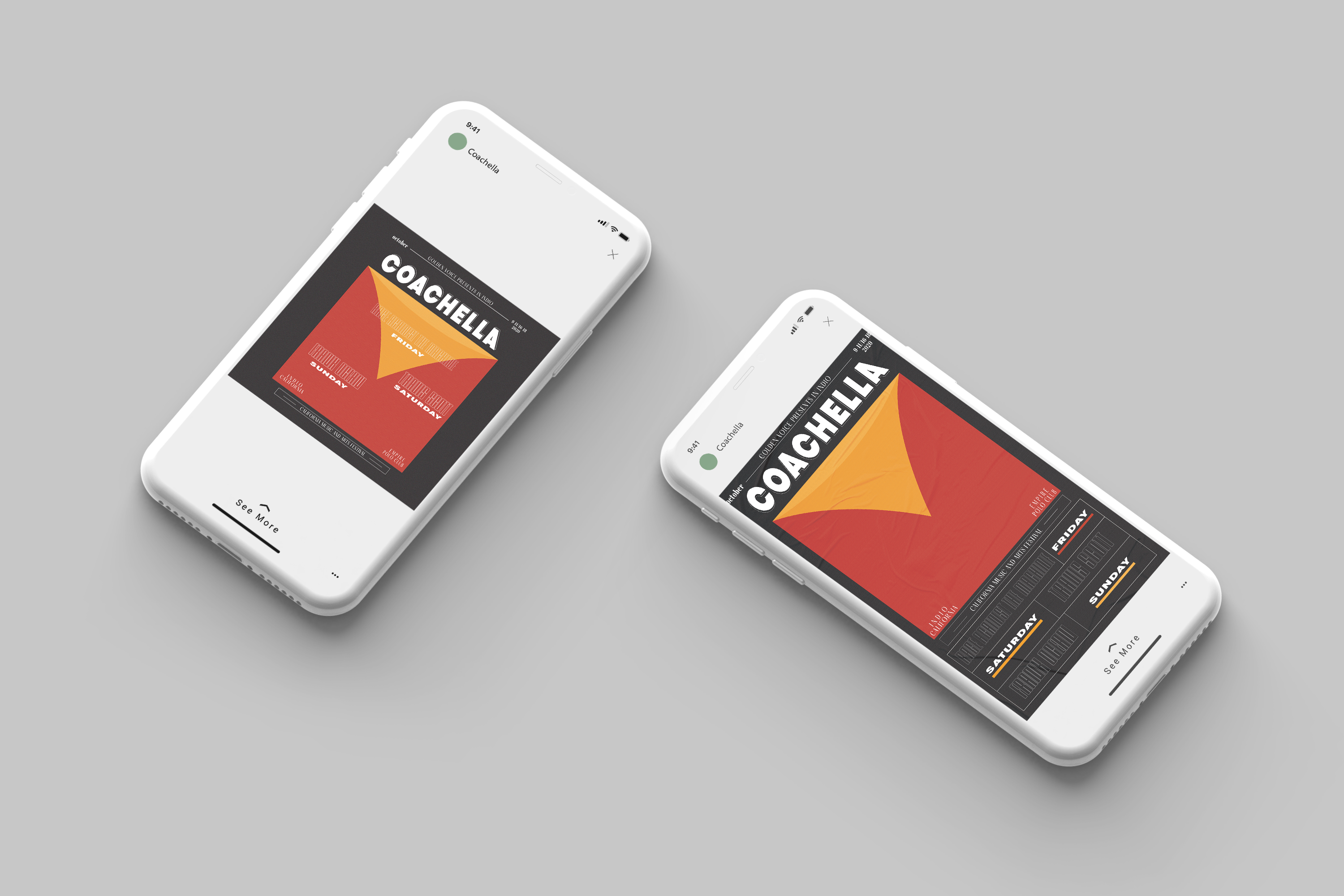
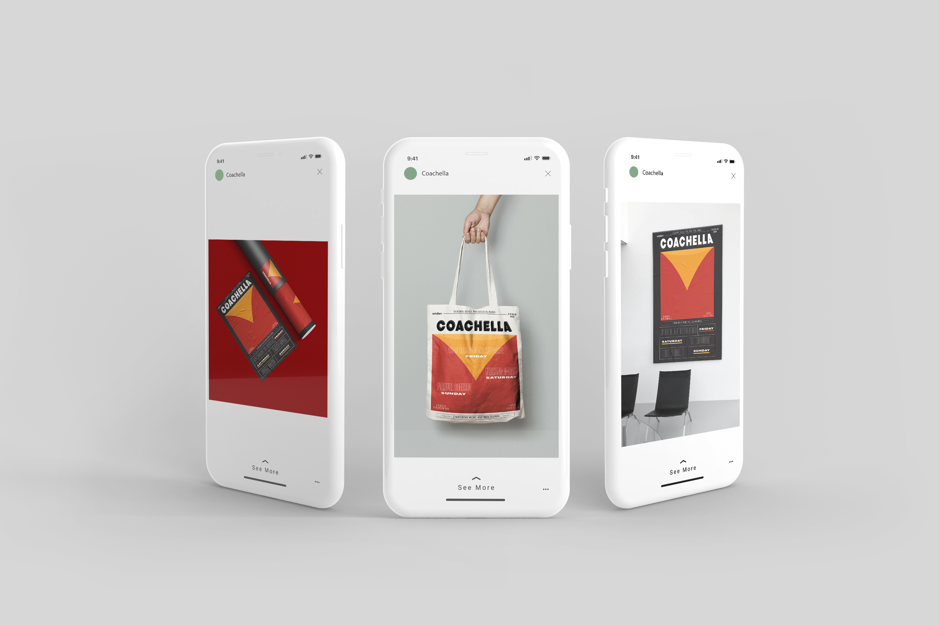
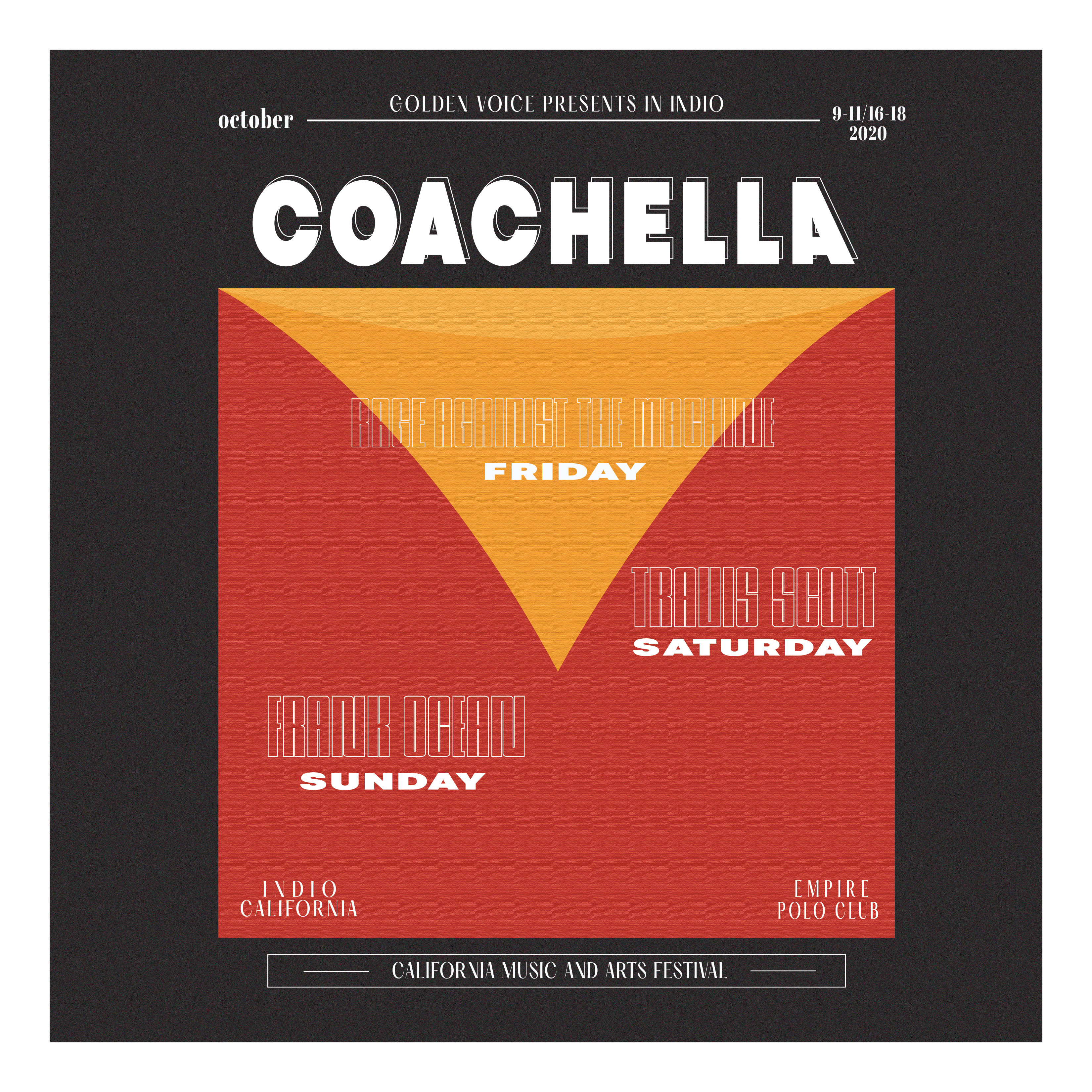
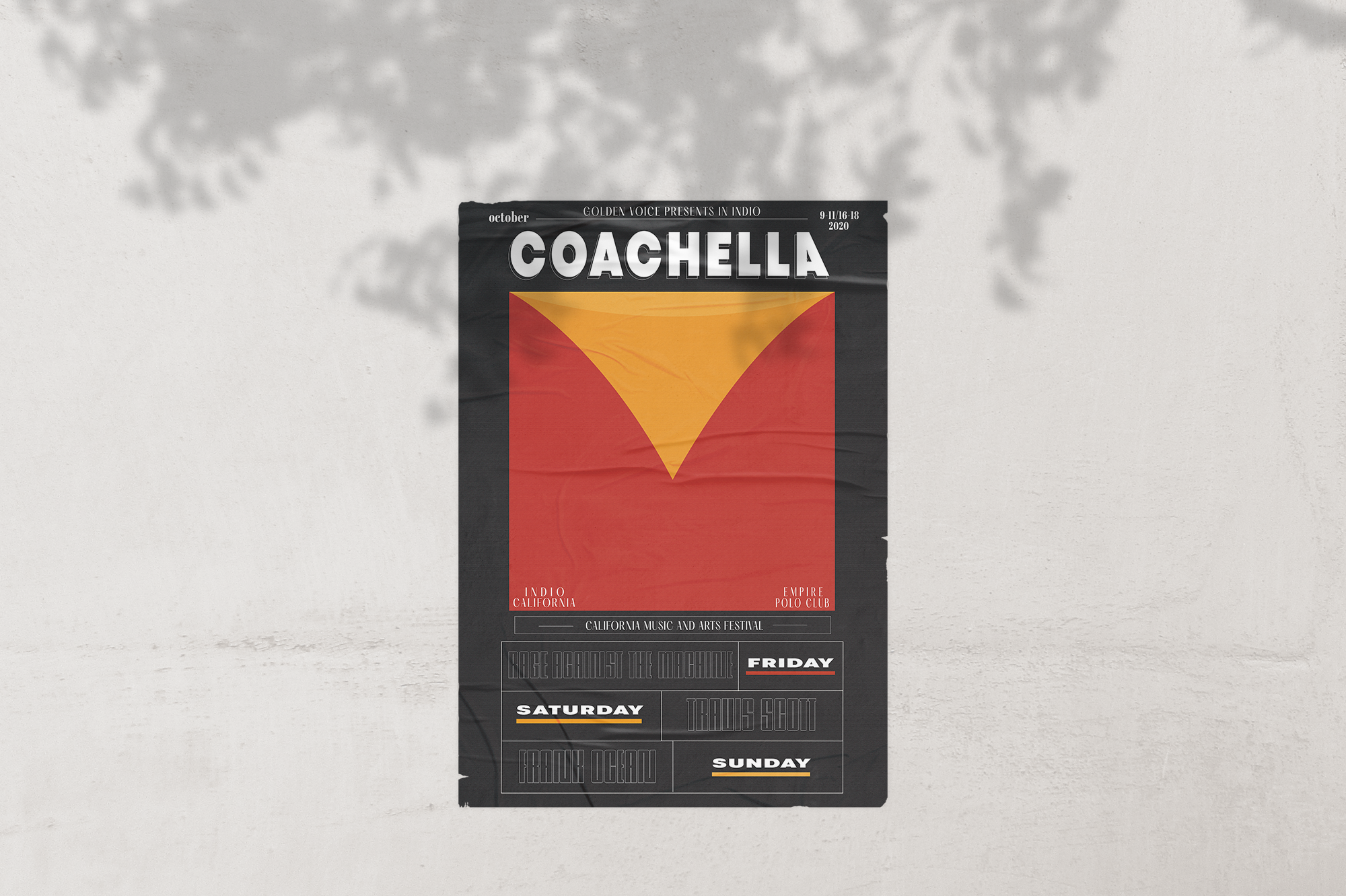
Coachella has always been known to have laid back and desert-like aesthetics. I wanted to give them a more futuristic look while still keeping the sunset and desert colors in the design to contrast against the dark background. This allows for foreground elements such as bold typography to pop against a near indiscernible/textured background.This type of aesthetic is a mood, and is definitely fun to experiment different typefaces with.
SEE SOMETHING MORE